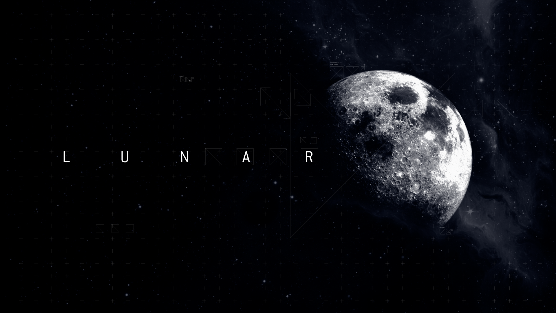
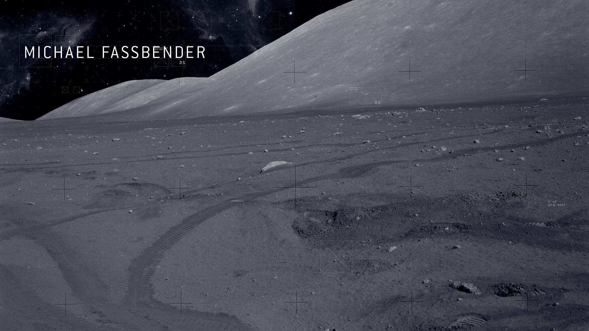
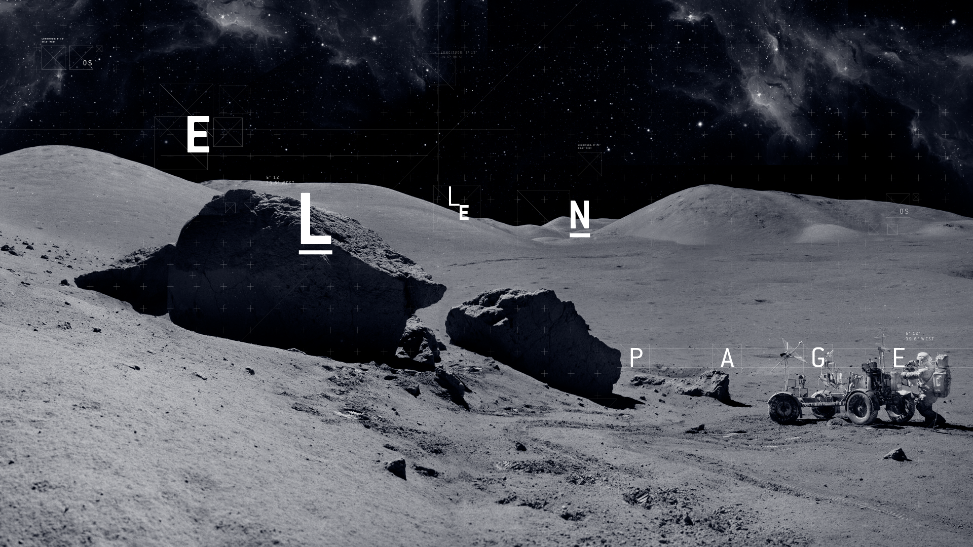
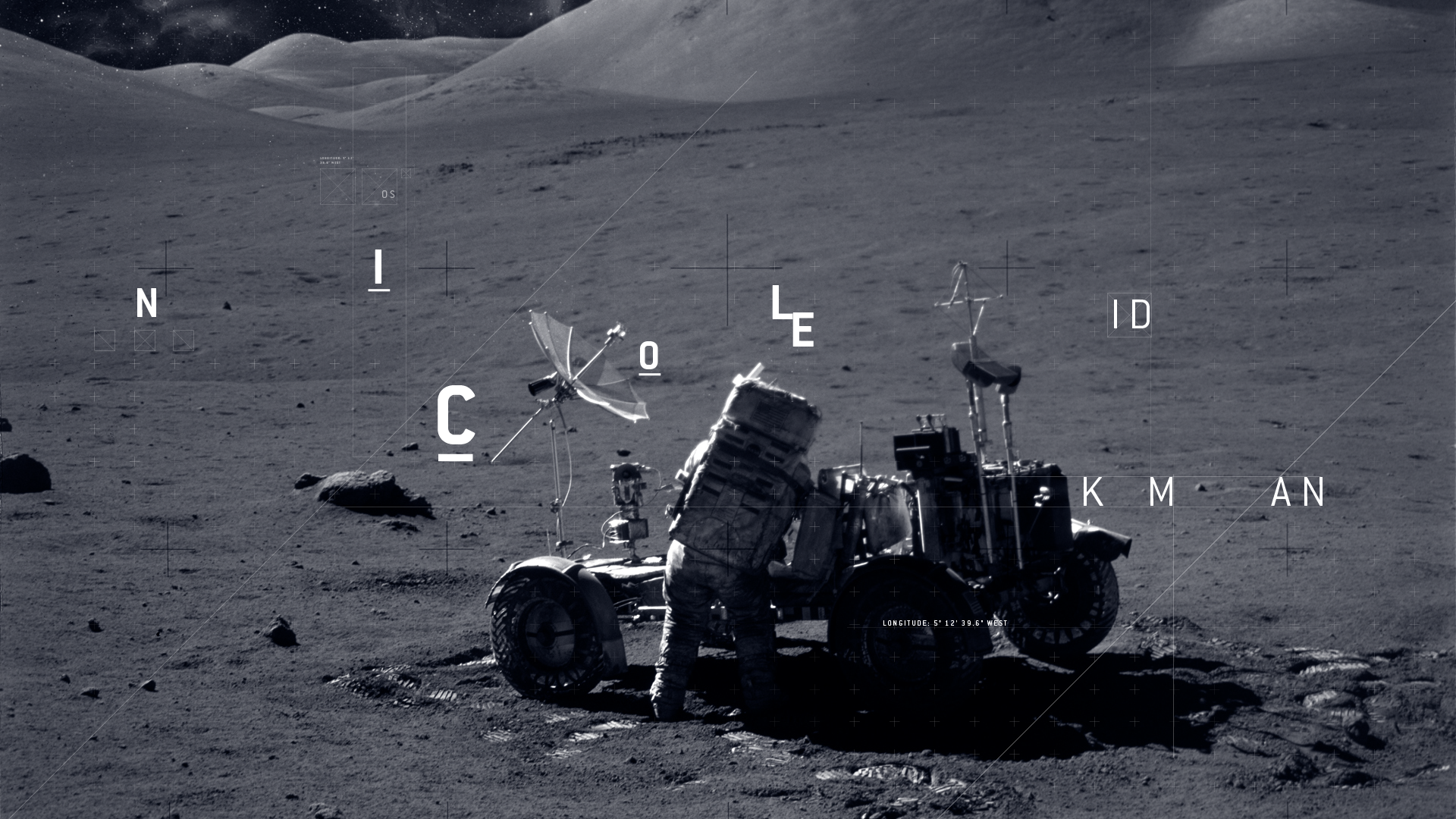
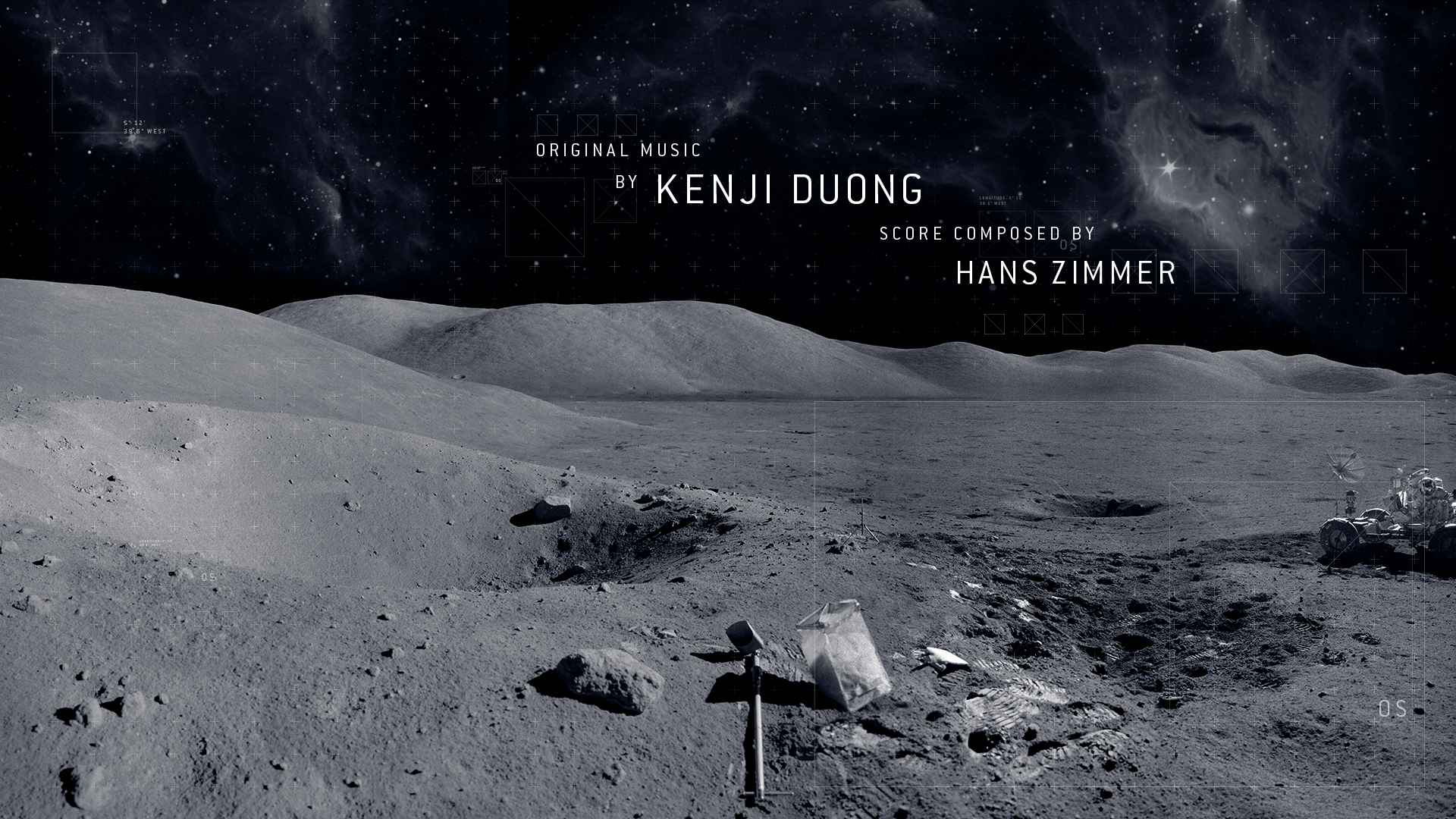
LUNAR
TITLE SEQUENCE
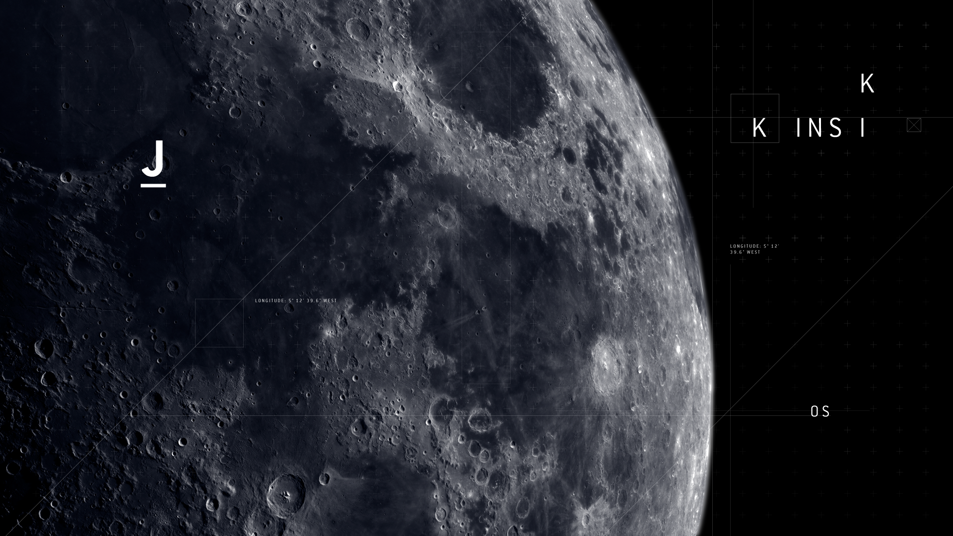
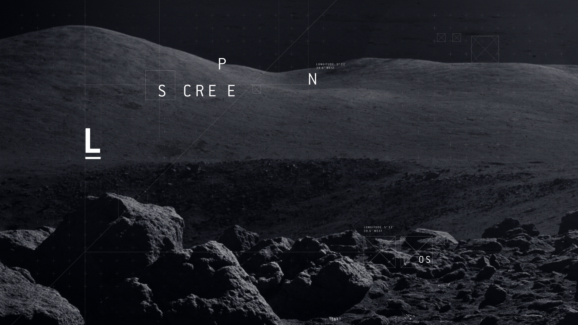
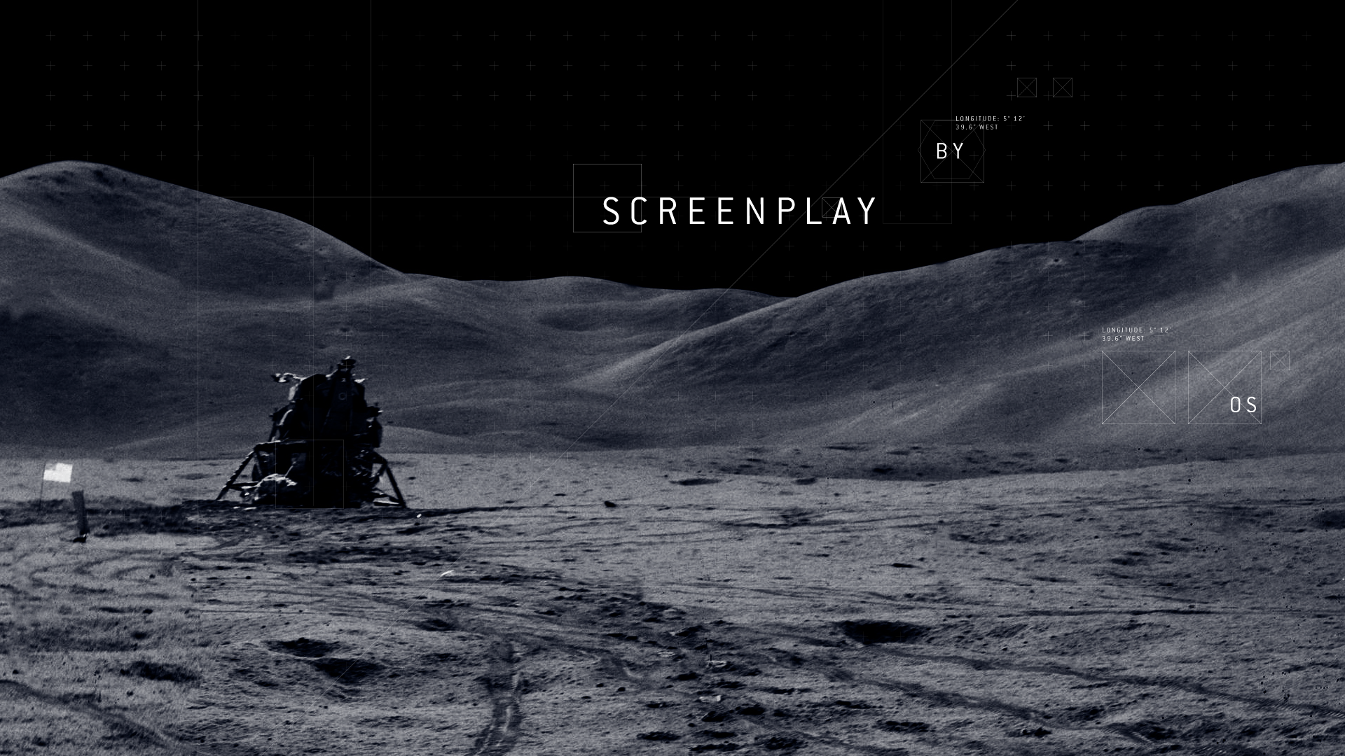
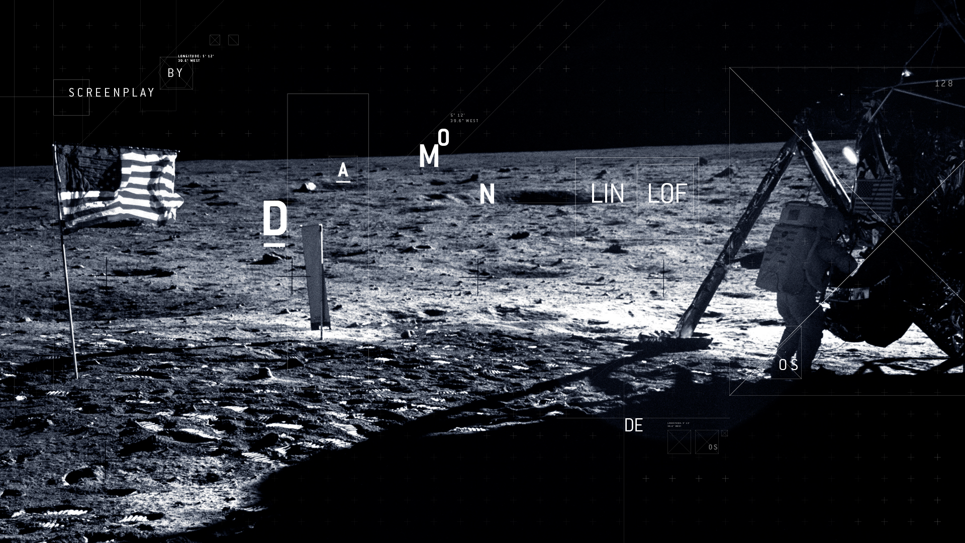
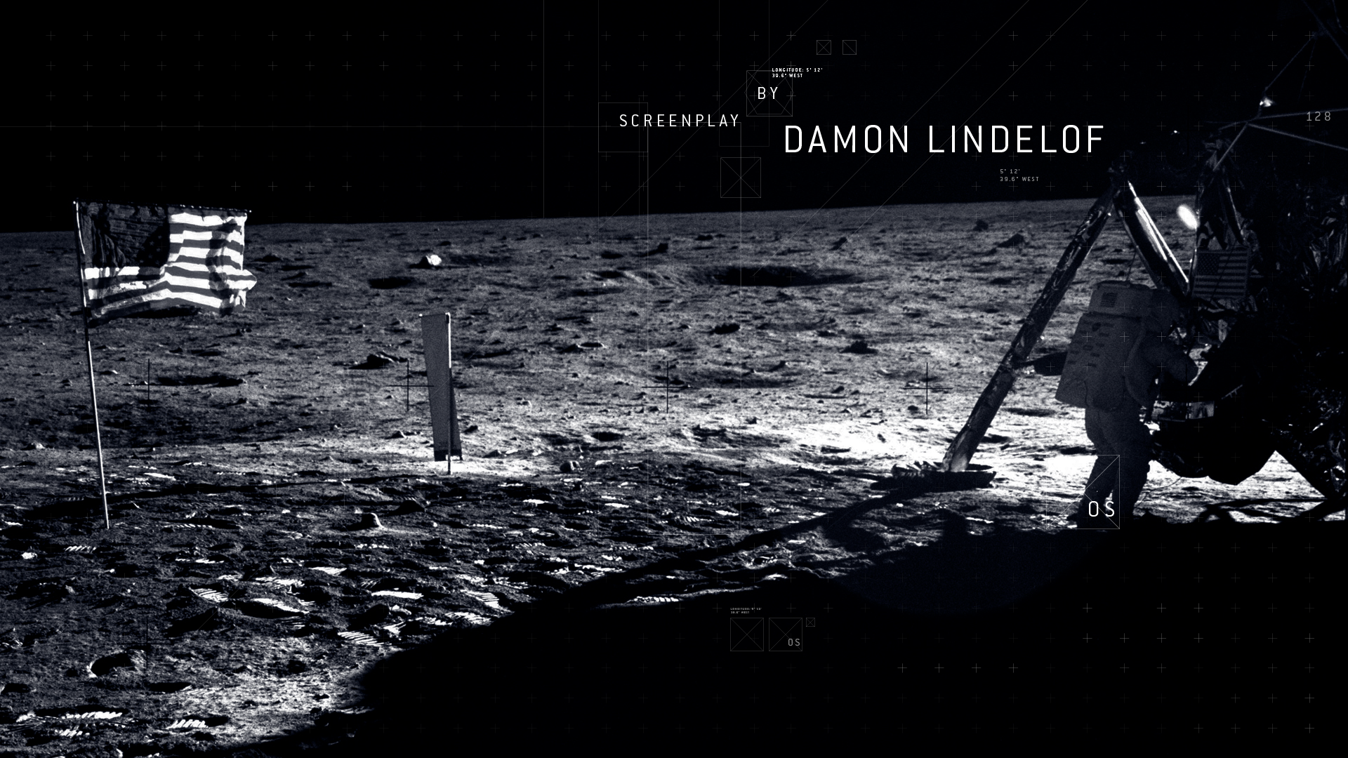
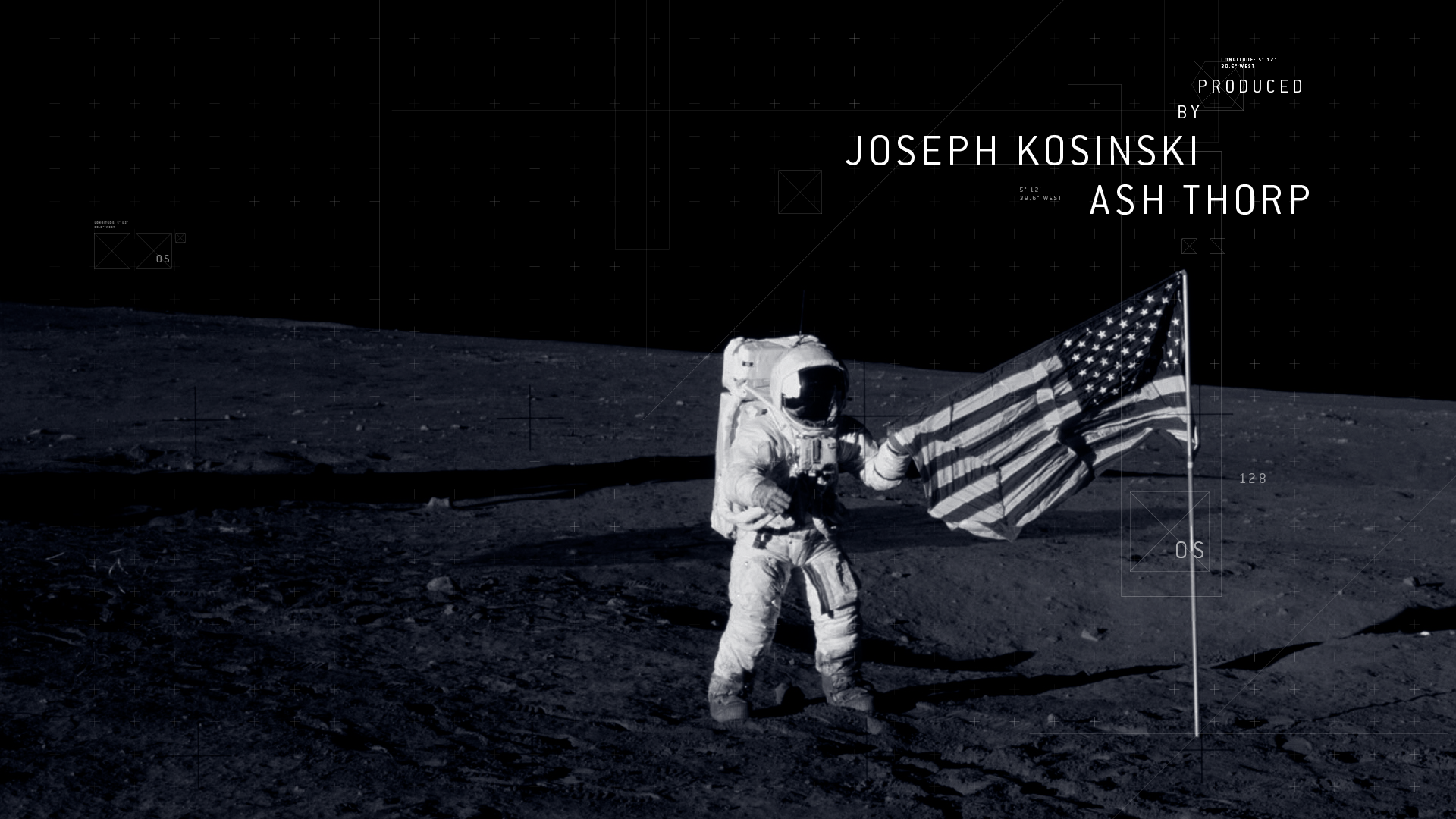
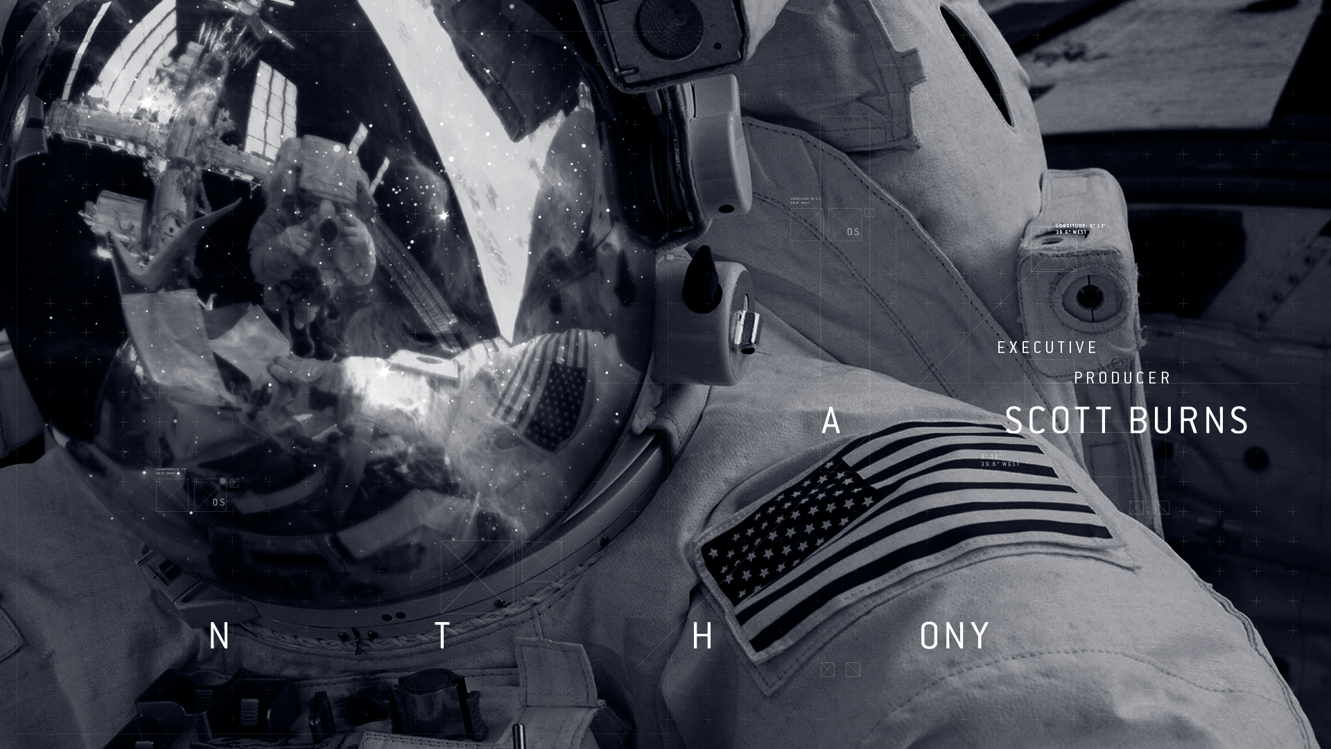
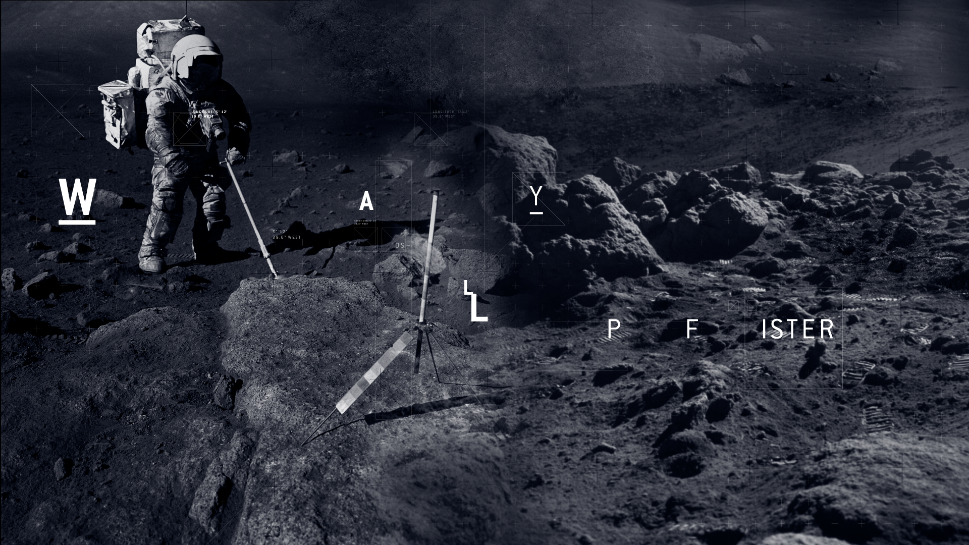
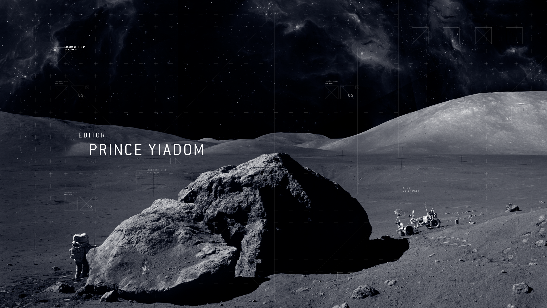
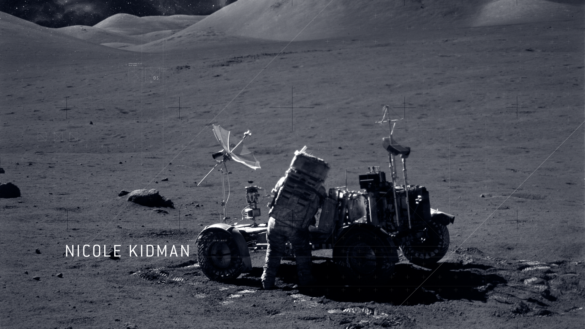
My Lunar titles grew from my fascination of Space and the NASA Moon landing. The project grew unexpectedly whilst researching the
NASA Moon landing and various other space related topics. Rather then coming up with a full story to which a title sequence
would be formed around, I came up with the theme of a opening sequence focused on the feel and atmosphere
that surrounds Space and the idea of being lost and isolated in Space.
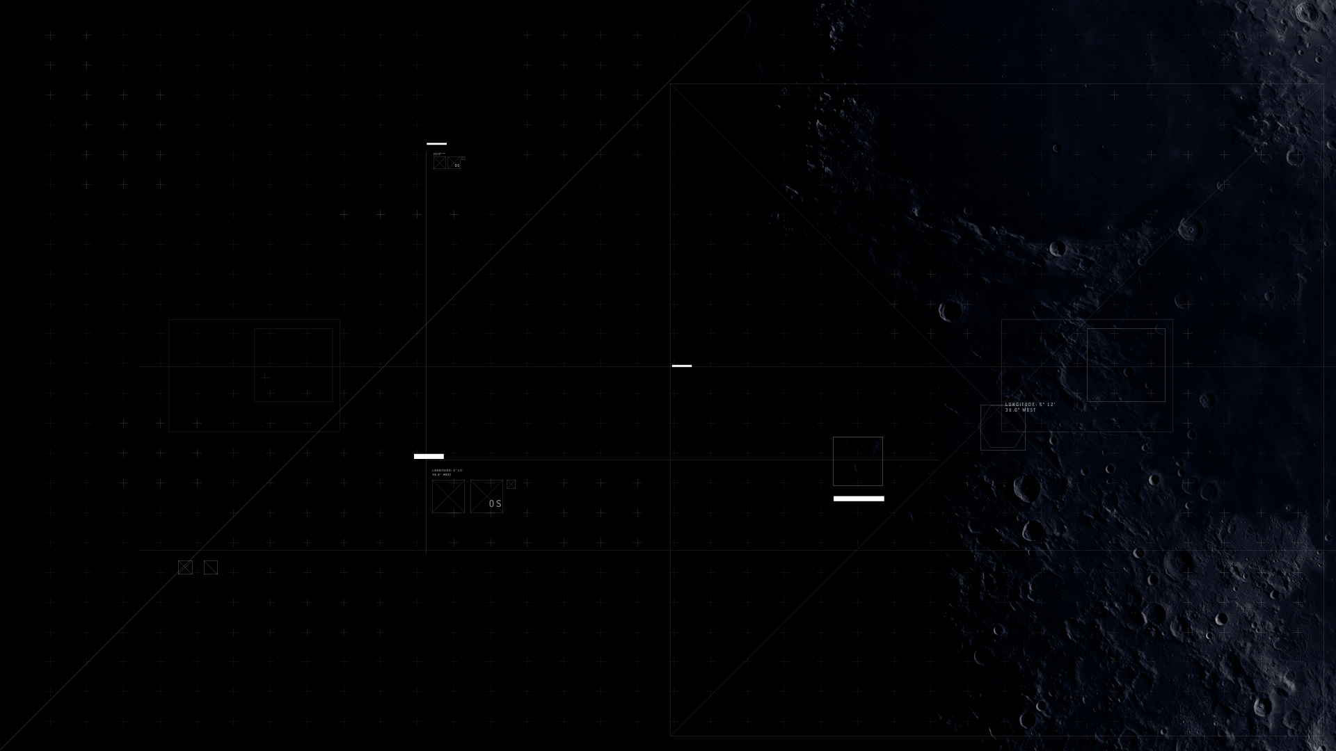
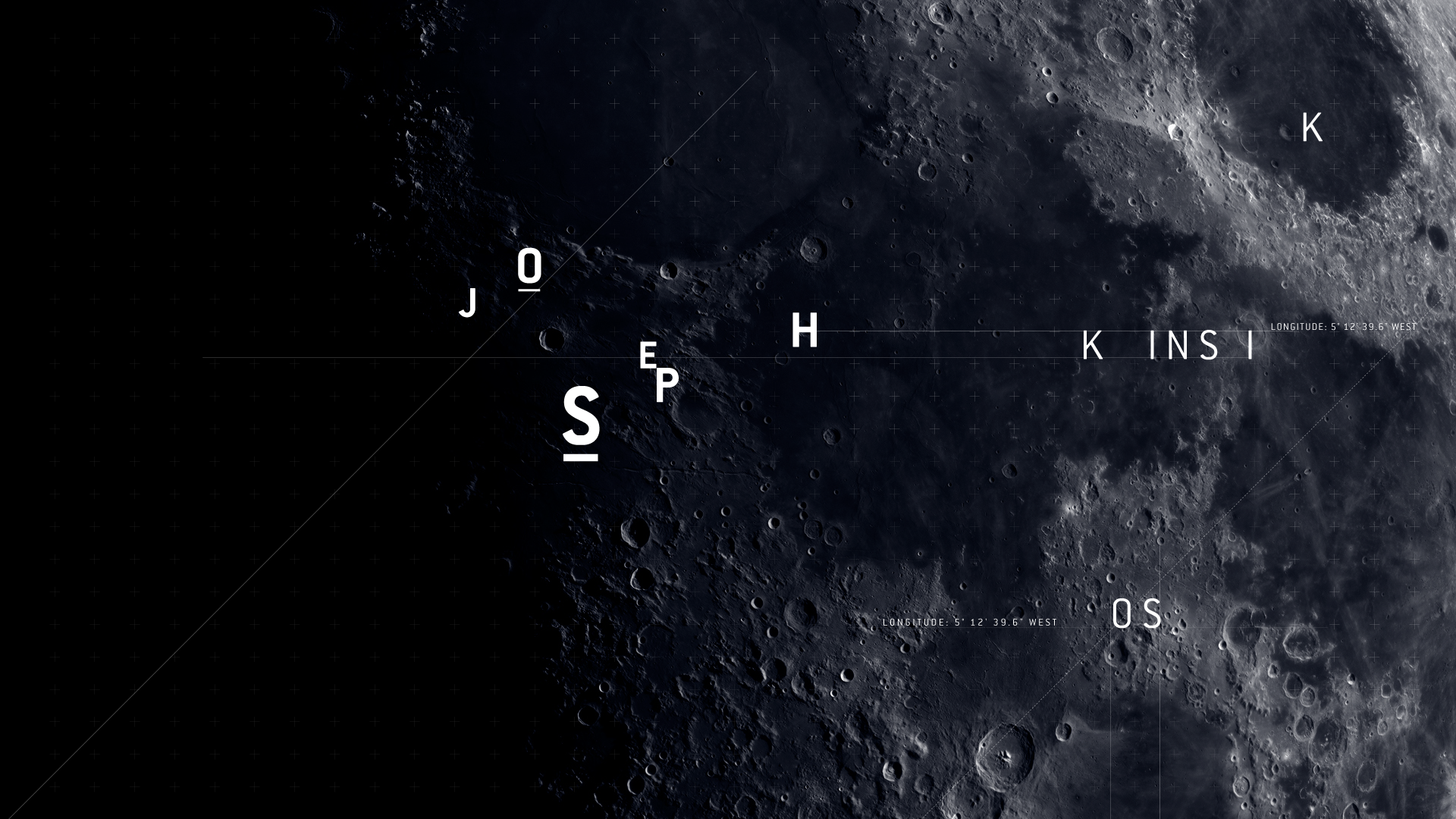
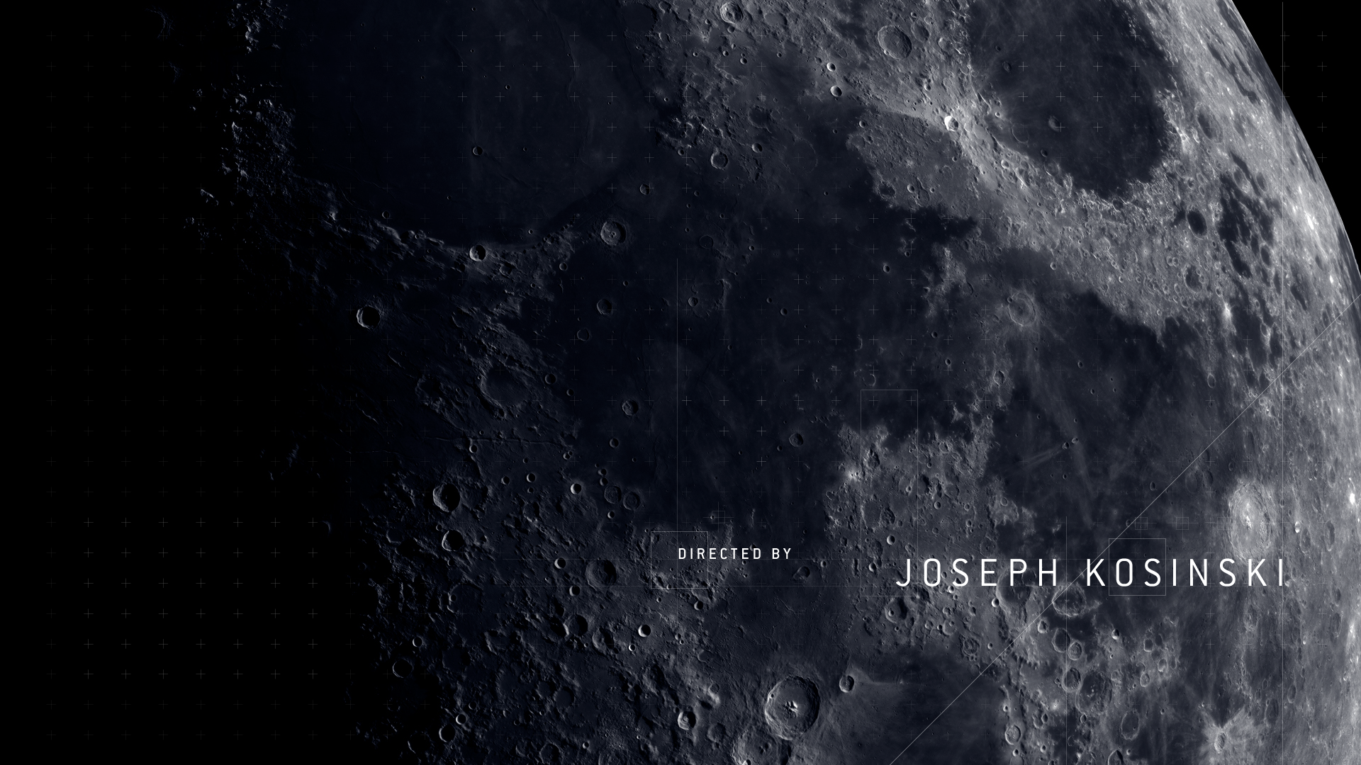
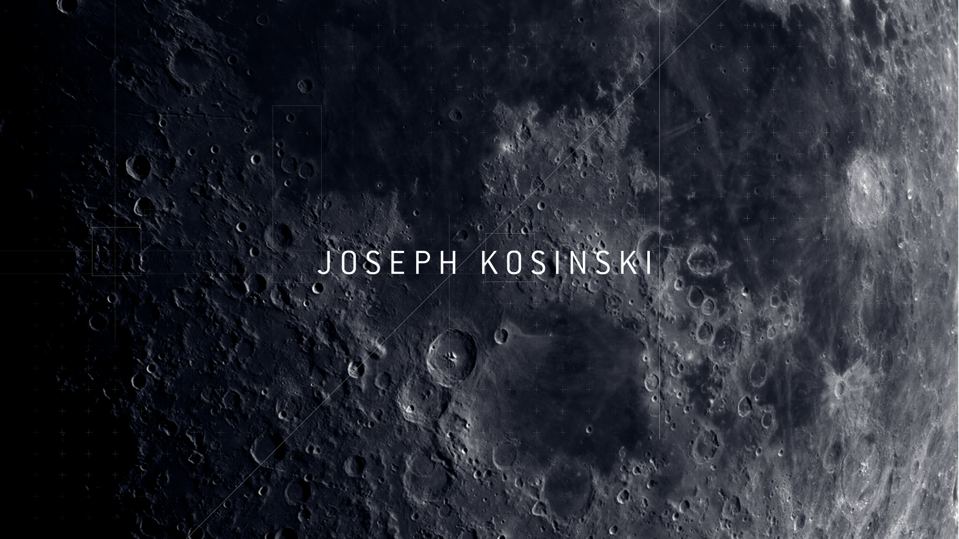
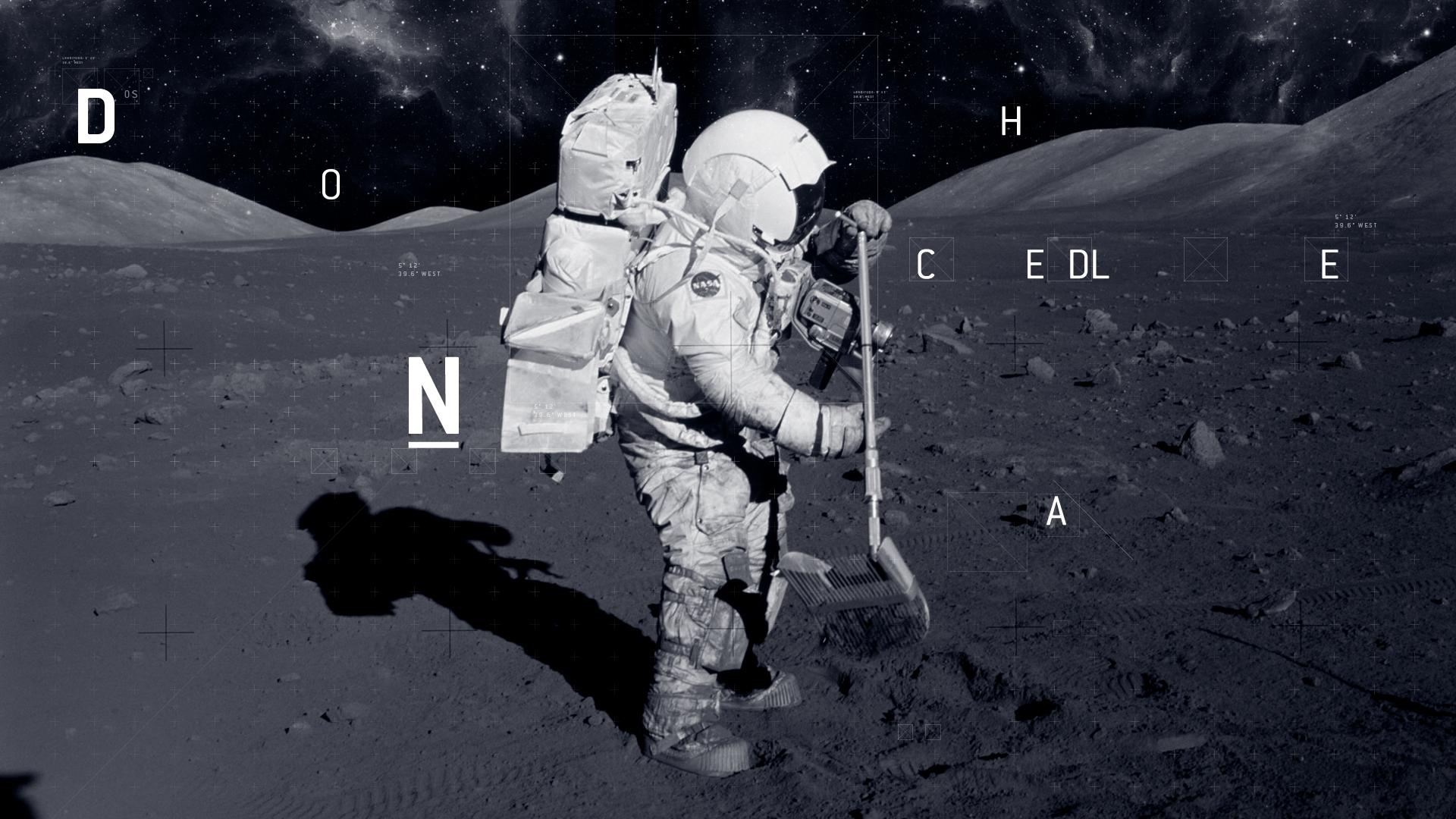
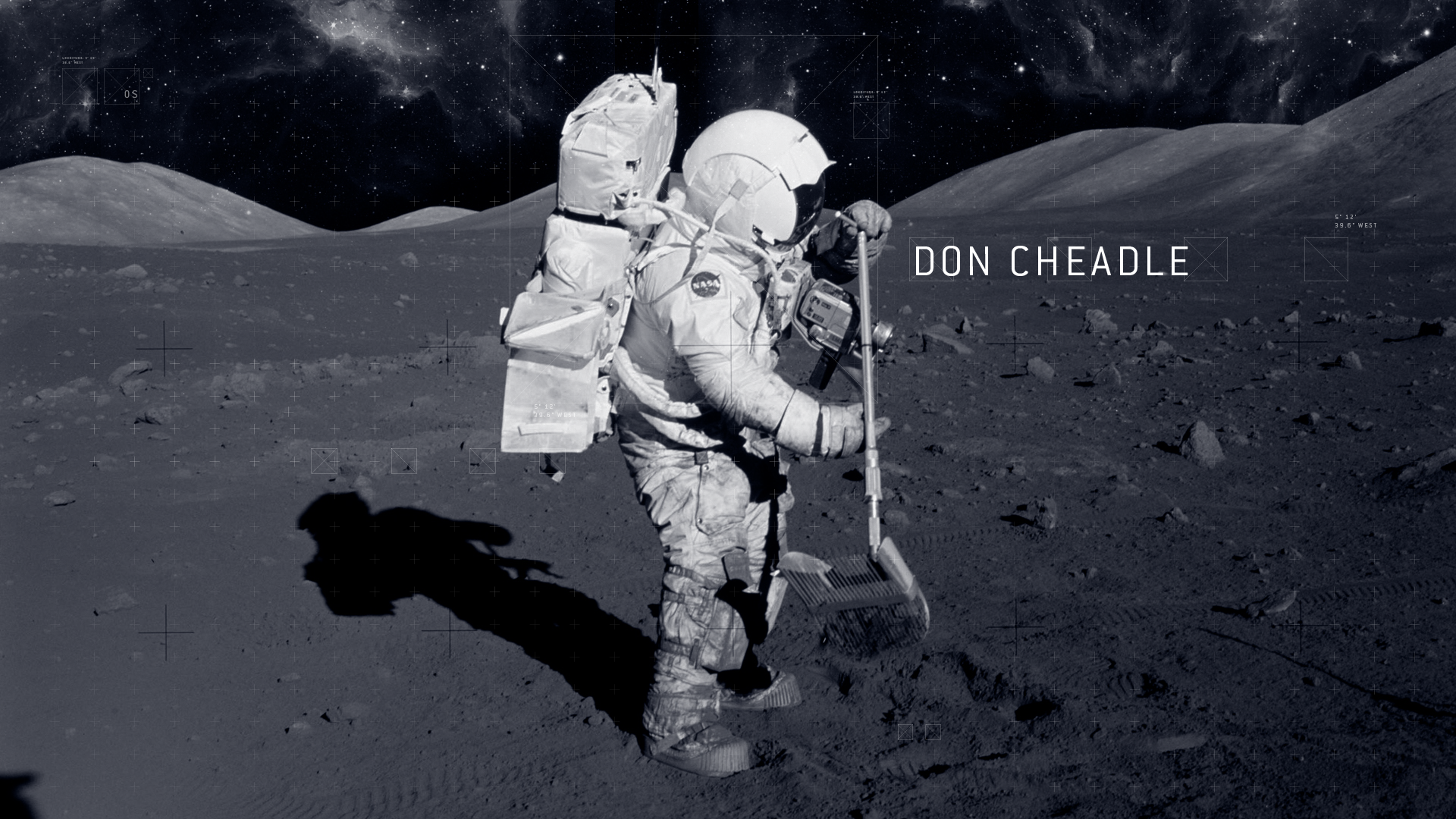
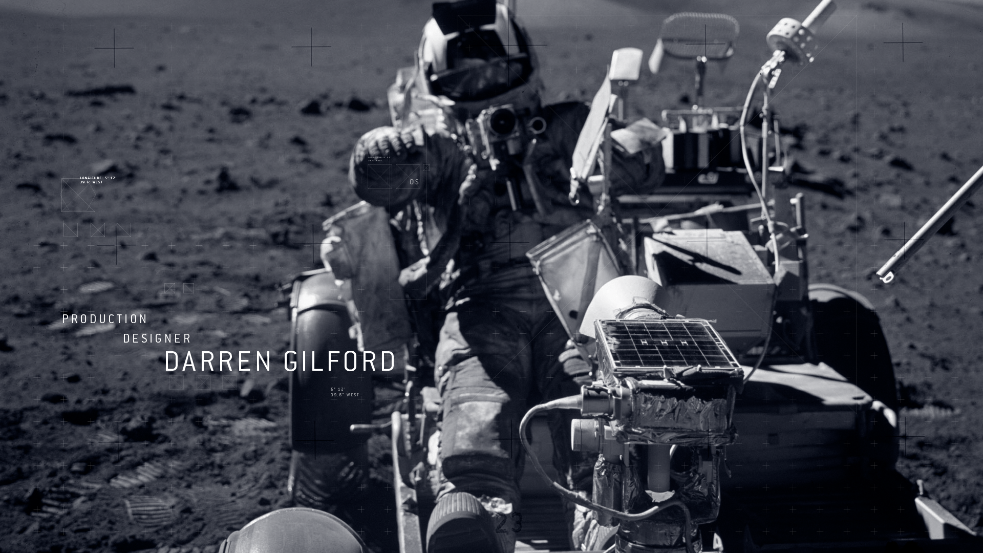
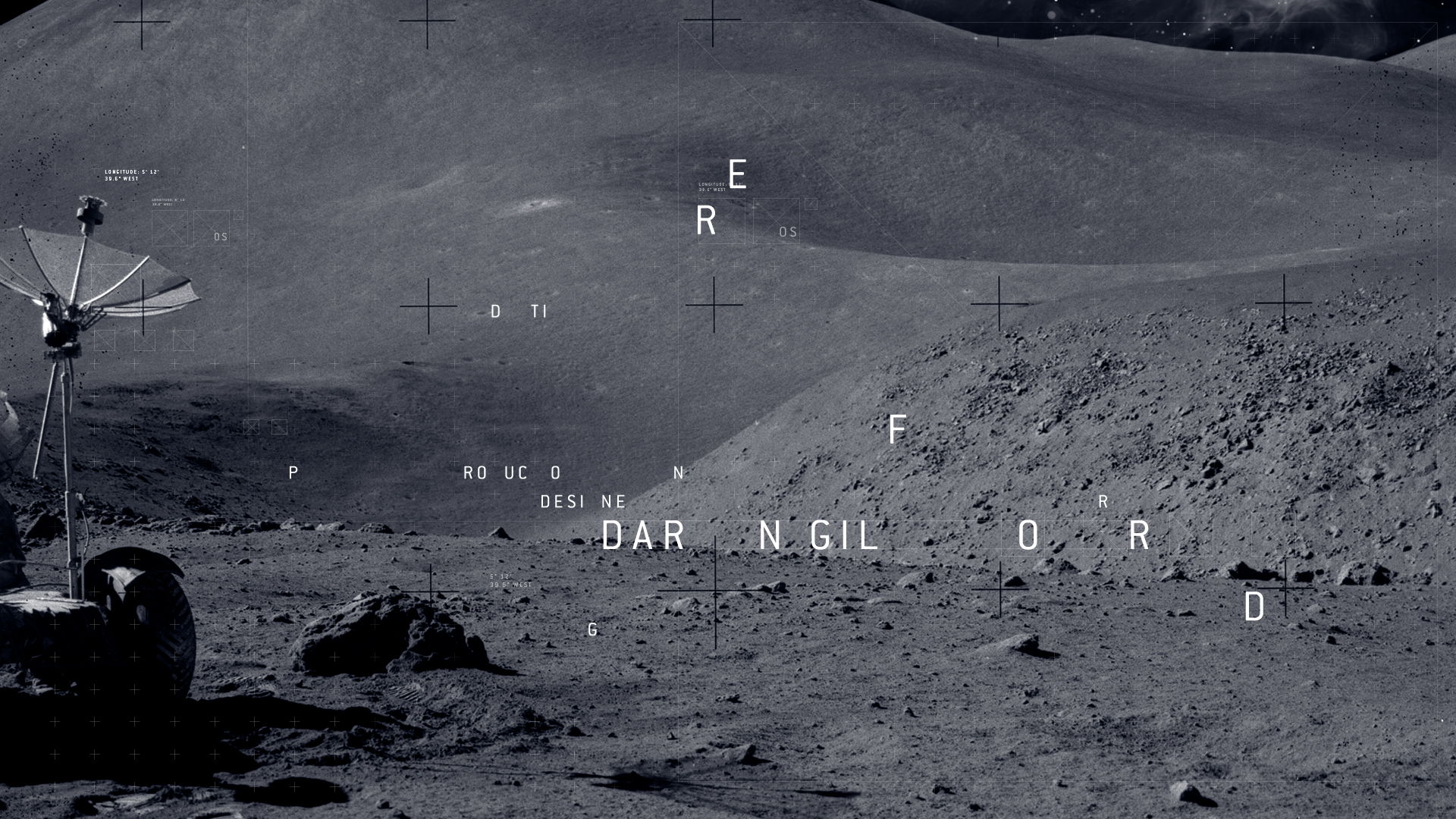
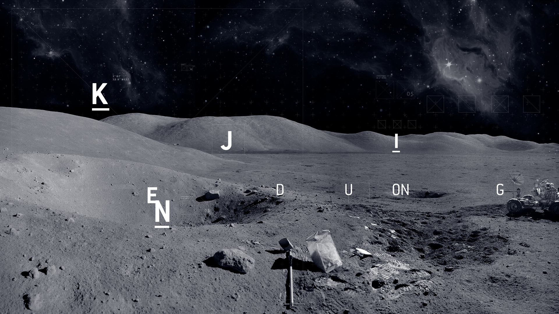
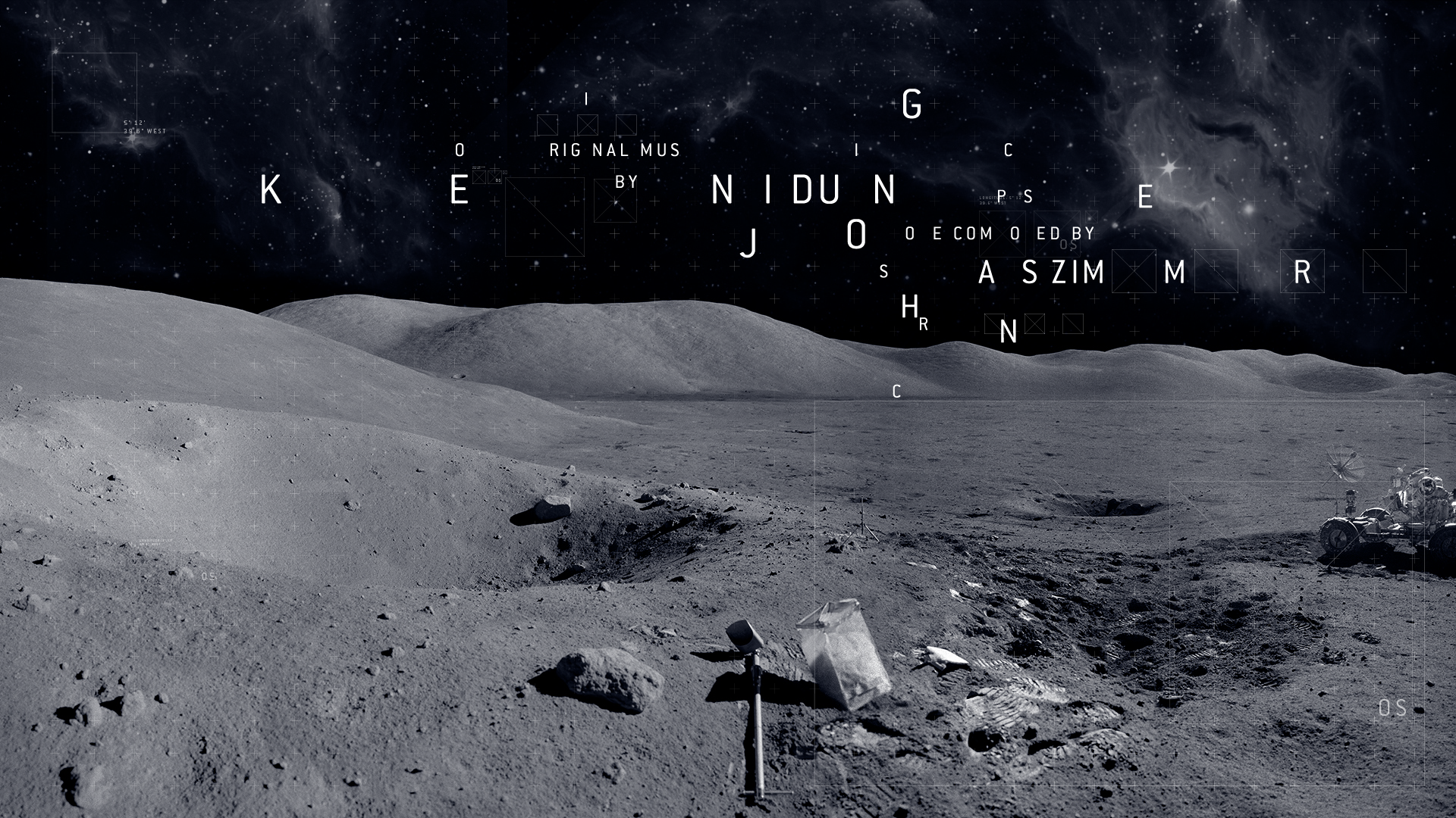
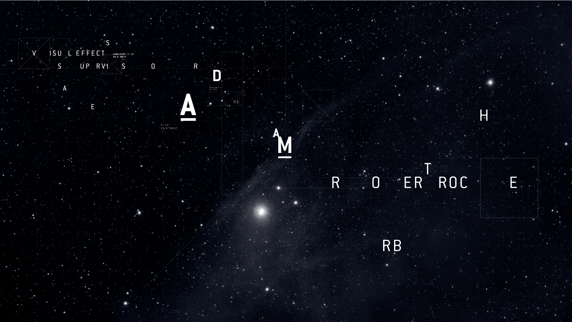
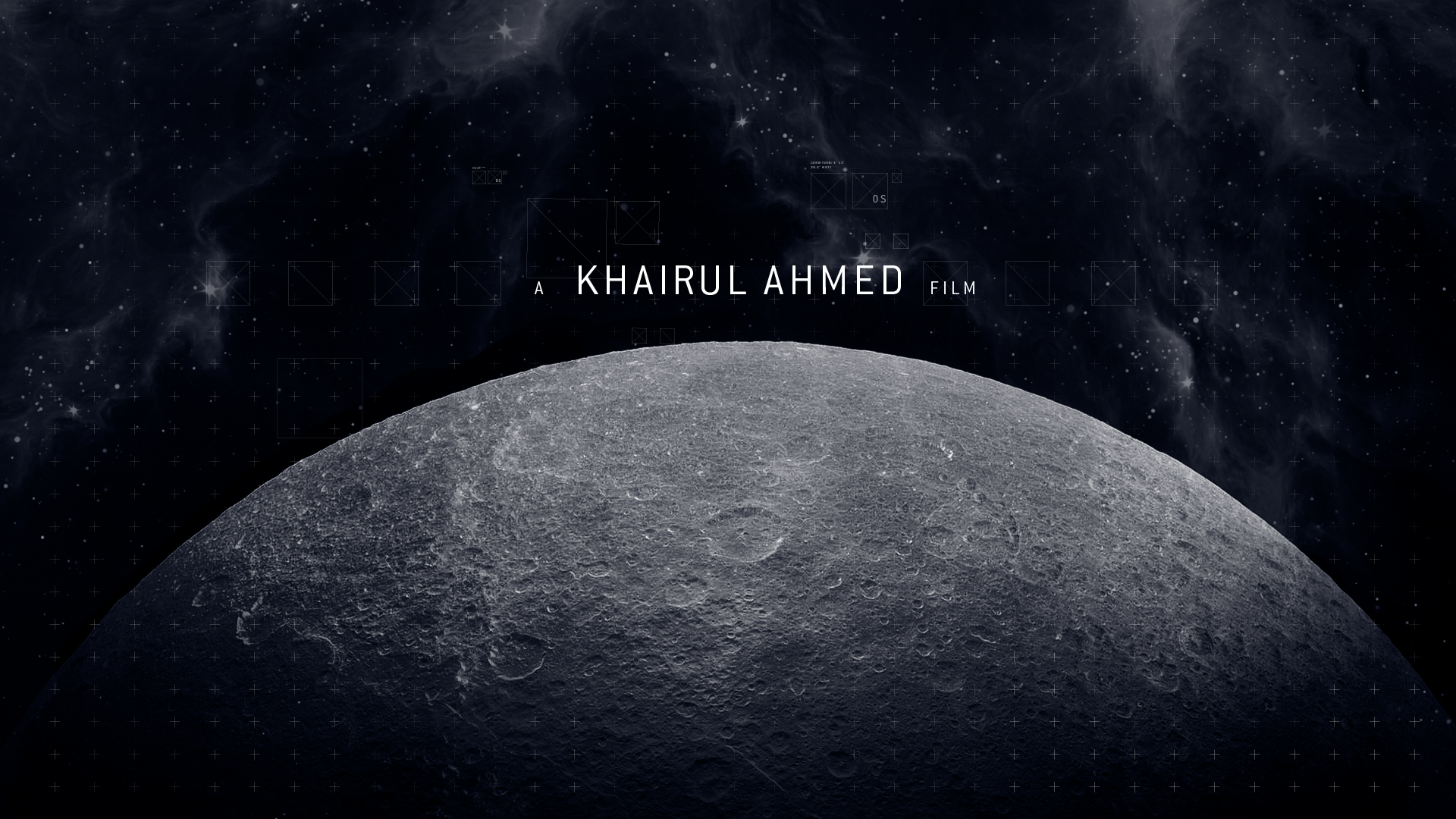
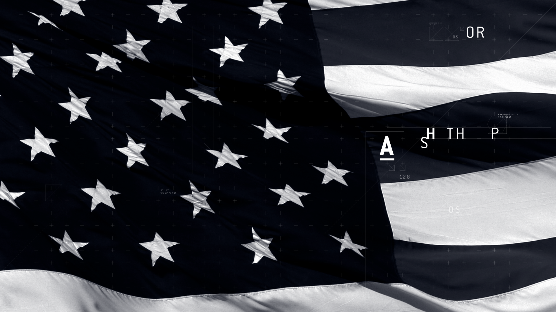
To carry this idea I wanted to focus heavily on the use of typography and the subtle use of imagery. I wanted to challenge myself to see
what I could create. I made sure all my typography followed a theme to carry the piece; I specifically isolated the type into sections
to give it depth, character and most importantly to give the feel of isolation and being lost.
Inspired by the work of Danny Yount, I studied his use of typography as I found his design elements to be very strong and striking,
something I wanted to achieve. As this project was pre-Oblivion, once again I could see why I loved the work of Danny Yount.
His use of typography is very minimal but has such an impact and is graphically stunning. So whilst developing my titles,
I kept trying to strip back and simplify my elements.
